 Check out this quick video on speeding up your Photoshop adjustment layer usage with keyboard shortcuts. Video from Layers Magazine.
Showing posts with label photoshop. Show all posts
Showing posts with label photoshop. Show all posts
Friday, April 3, 2009
Adjustment Layers Keyboard Shortcuts
Check out this quick video on speeding up your Photoshop adjustment layer usage with keyboard shortcuts. Video from Layers Magazine.

Monday, March 23, 2009
Smart Objects - The bridge between 2 programs

As we saw in class Illustrator has many tricks up it's sleeve. Not the least of which are some of the 3d options shown in the above image. All of the above shapes, unique to illustrator could be pasted into Photoshop as Smart Objects. As Smart Objects they would retain all their vector clarity. The above effects include the Mesh tool, 3d revolve and the Blend Tool.
A smart object can be created in Photoshop by selecting Object > Smart Object > Make. Additionally a smart object can be made when you copy and object from Illustrator and paste into Photoshop (at least Photoshop will prompt you and ask if you want to import the object as a smart object). The advantage to a smart object is that you can manipulate layers without destroying the original layers pixel integrety. For example you could have a large photo that you have converted into a Smart Object. You can scale that photo down to 20 percent and later scale it back up to 100 without suffering any pixel loss.
You edit a smart object by double clicking it in the layers palette and working inside of a new window that will appear. Once you have made your desired changes (I.E. adding additional layers or effects) you select File > Save and the changes will automatically appear in your original document window. You can then close the smart object window as well.
If the smart object was placed from Illustrator (or copy and pasted from Illustrator) the new window that opens when you double click your smart object layer will actually be in Illustrator. The same rules apply though. Make any changes you wish, hit save and the updates will appear in your original document in Photoshop.
Click here for Smart Object Video Lesson
Monday, February 16, 2009
Constructing an Image (Or how to make a cake)
Drawing is drawing whether done with a pen and paper, a stick in the mud or a mouse and the computer. The better your understanding of how to make a good drawing the better your ability to work with line, shape, tone, color, texture, scale, composition, etc. If you want your image to be cohesive, dynamic and visually engaging you will have to know how to deal with these issues because there is no other option. More info on the specifics and examples of drawing fundamentals can be found on my other blog here. For this example however I'm going to stress one simple concept: WORK LOOSE BEFORE YOU WORK TIGHT (i.e. don't put on the icing until the cake is baked).

A quick gesture of your subject and environment will empower you to make big decisions in just a few quick seconds. The speed of the gesture will help you to make interesting decisions before you know you are even making them. Although this is just a first step the major formal relationships should be developing here.

The immediate next step I used was to stay loose but to make my initial underdrawing more specific through an application of color and tone. Some of the intuitive and split-second decisions made during these first 2 steps will play a major role in the development of the rest of the work.

I now started using my underdrawing as an armature on which to build my photographic elements. The looseness of the marks allows the photographic pieces to fall into place in a far more natural way than had you started without an underdrawing.

As the piece develops I focus on more and more specific parts (torso first, then arms then hands, then fingers, then fingernails). Remember large to small. Don't invest in the details yet. Details in drawing are the icing on the cake. Put them on too early and it's like icing a cake that has not yet been baked! It's an equally bad approach.

Final steps involve more detail work, and some additional decorative elements that help create a sense of space. Decoration is easy. Details are relatively easy as well. It's the bulk of the cooking, mixing all the ingredients together and heating everything to the right temperature in just the right kind of pan that will determine how good your cake is. The frosting and candles are just additional compliments. Happy baking.

A quick gesture of your subject and environment will empower you to make big decisions in just a few quick seconds. The speed of the gesture will help you to make interesting decisions before you know you are even making them. Although this is just a first step the major formal relationships should be developing here.

The immediate next step I used was to stay loose but to make my initial underdrawing more specific through an application of color and tone. Some of the intuitive and split-second decisions made during these first 2 steps will play a major role in the development of the rest of the work.

I now started using my underdrawing as an armature on which to build my photographic elements. The looseness of the marks allows the photographic pieces to fall into place in a far more natural way than had you started without an underdrawing.

As the piece develops I focus on more and more specific parts (torso first, then arms then hands, then fingers, then fingernails). Remember large to small. Don't invest in the details yet. Details in drawing are the icing on the cake. Put them on too early and it's like icing a cake that has not yet been baked! It's an equally bad approach.

Final steps involve more detail work, and some additional decorative elements that help create a sense of space. Decoration is easy. Details are relatively easy as well. It's the bulk of the cooking, mixing all the ingredients together and heating everything to the right temperature in just the right kind of pan that will determine how good your cake is. The frosting and candles are just additional compliments. Happy baking.
Wednesday, February 11, 2009
Eyedropper Color Matching
The following exercise will look at how you can use the often overlooked eyedropper tool and the sometimes overlooked info palette to work with the curves palette to match color between two images. I used this same technique in class to color correct based upon a value in the image that you specify as absolutely gray. Essentially both ideas hinge on this same technique. It's not the most intuitive procedure so here's the breakdown:
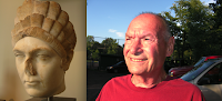
1) I want to morph the eyes from this sculpture onto the man's face. First we need to make the color of the sculpture match the fleshy pink of the man's face. Fortunately the light source is coming from a similar direction and the angle of the head is similar.
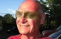
2) I used the rectangular marque to make a selection around each eye of the sculpture image and used the move tool to drop those pixels into the image of the man's face. I transformed each (scale, rotation) slightly to fit the structure of his head.
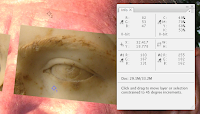
3) I selected the eye dropper, set the sample size to 11 x 11 and SHIFT-clicked on the sculpture(make sure you are on the right layer) in an area where the most average color existed. By average I mean, not in the dark shadows or highlights but the local tone of the majority of the sculpture. I then went to the layer with the man's face and SHIFT-clicked the average tone there as well. You can see what areas I selected in the above image. Each shift-click creates a target (labeled #1 and #2 in this example) that represents the RGB values (labeled #1 and #2) that have now popped up in the info palette. In the above image the RGB in the sample of the man's face (#2) is R255, G182, B162. The sculpture sample area (#1) is R183, G167, B131. To get the sculpture color more like the flesh of the man's face we need to make the RGB values for the sampled area of the sculpture to match the RGB values of the man's face. It takes a lot of words to describe but it's very straight forward. Here's how to proceed:
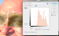
4) To alter the exact values on your sculpture layer to match the exact values on the flesh you need to tell photoshop the exact area of the curves that needs to be affected. To do this view each channel (R, G, or B) individually in the curves palette and APPLE-click the target sample on the sculpture layer (in the above image it's #1). As a tip make sure you are on the layer of in the layers palette that you want to affect.
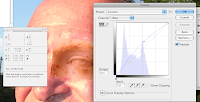
5) Once you have APPLE-clicked the target in each of the channels you can use the up and down arrow keys to nudge the values displayed in the info palette for #1 to be exactly like #2. Remember all this is just a matter of taking one set of RGB numbers and getting them to look just like another set of RGB numbers. That's it.
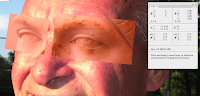
6) Above you can see the results of matching these values and how those affect the curves in each channel. You can also see how the sculpture layer has a very similar color range to the flesh of the man's face. Check out the #1 and #2 in the info palette. They are just about spot on.
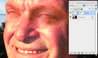
7) I added a layer mask to the layer of the sculpture eyes and used a soft brush around most of the pixels to blend the two layers together. I used a harder edge around the outter left edge where his face meets the sky.
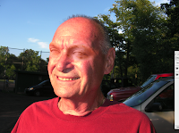
8) In the end I ended up going back into the curves once more to adjust the overall RGB for each eye to increase the brightness of the midtones in the eye on the left and decreased these values slightly to darken up the eye on the right. I also slightly desaturated the eye on the right using hue and saturation because I felt like the colors had grown a bit too intense. There's no one fix-all for such a make-over but I did the majority of this exercise using the eye dropper, the curves and the info palette.

1) I want to morph the eyes from this sculpture onto the man's face. First we need to make the color of the sculpture match the fleshy pink of the man's face. Fortunately the light source is coming from a similar direction and the angle of the head is similar.

2) I used the rectangular marque to make a selection around each eye of the sculpture image and used the move tool to drop those pixels into the image of the man's face. I transformed each (scale, rotation) slightly to fit the structure of his head.

3) I selected the eye dropper, set the sample size to 11 x 11 and SHIFT-clicked on the sculpture(make sure you are on the right layer) in an area where the most average color existed. By average I mean, not in the dark shadows or highlights but the local tone of the majority of the sculpture. I then went to the layer with the man's face and SHIFT-clicked the average tone there as well. You can see what areas I selected in the above image. Each shift-click creates a target (labeled #1 and #2 in this example) that represents the RGB values (labeled #1 and #2) that have now popped up in the info palette. In the above image the RGB in the sample of the man's face (#2) is R255, G182, B162. The sculpture sample area (#1) is R183, G167, B131. To get the sculpture color more like the flesh of the man's face we need to make the RGB values for the sampled area of the sculpture to match the RGB values of the man's face. It takes a lot of words to describe but it's very straight forward. Here's how to proceed:

4) To alter the exact values on your sculpture layer to match the exact values on the flesh you need to tell photoshop the exact area of the curves that needs to be affected. To do this view each channel (R, G, or B) individually in the curves palette and APPLE-click the target sample on the sculpture layer (in the above image it's #1). As a tip make sure you are on the layer of in the layers palette that you want to affect.

5) Once you have APPLE-clicked the target in each of the channels you can use the up and down arrow keys to nudge the values displayed in the info palette for #1 to be exactly like #2. Remember all this is just a matter of taking one set of RGB numbers and getting them to look just like another set of RGB numbers. That's it.

6) Above you can see the results of matching these values and how those affect the curves in each channel. You can also see how the sculpture layer has a very similar color range to the flesh of the man's face. Check out the #1 and #2 in the info palette. They are just about spot on.

7) I added a layer mask to the layer of the sculpture eyes and used a soft brush around most of the pixels to blend the two layers together. I used a harder edge around the outter left edge where his face meets the sky.

8) In the end I ended up going back into the curves once more to adjust the overall RGB for each eye to increase the brightness of the midtones in the eye on the left and decreased these values slightly to darken up the eye on the right. I also slightly desaturated the eye on the right using hue and saturation because I felt like the colors had grown a bit too intense. There's no one fix-all for such a make-over but I did the majority of this exercise using the eye dropper, the curves and the info palette.
Monday, February 2, 2009
Layer Maks
Layer masks are a dynamic way to work with layers in photoshop. You paint inside of the layer mask with black and white paint to hide or reveal your image. Black hides, White reveals, and Gray will make the pixels become semi-transparent (depending on how dark or how light the gray).
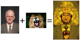
For the following quick tutorial we will combine the image of a man and the image of a lion to create a hybrid construction that utilizes the most interesting elements of each image. See below.
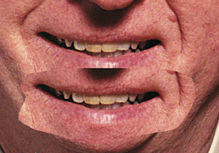
First I made selections around the man's features, copied and pasted them onto a new layer.
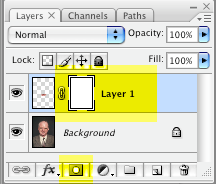
Then I created a layer mask by targeting the layer I wanted to apply the mask to and click the "add layer mask" icon in the bottom of the layers palette. Once you click this button you will notice a layer mask has been added to your layer.
Using the brush tool you can paint into this layer mask with white or black paint to reveal or hide pixels respectively. Make sure you are on the layer mask and not on the layer itself when you are using the white and black paint. The double border around any layers thumbnail will ensure you are indeed on this layer. I used a soft brush and painted with black paint to hide the hard outer edge of the pasted layer.
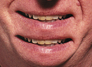
I continued this process with the man's features until I came to an interesting combination. Remember that altering your brush size (bracket keys on the keyboard) and brush hardness will help manipulate the image.
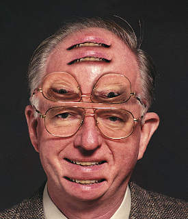
Next I made a selection around half of my lion's face and dragged it into Photoshop. I duplicated the layer (CMND +J) and flipped it horizontally (EDIT > TRANSFORM > FLIP HORIZONTAL). I proceeded to use layer masks on these new layers to create a sort of mask around the head of the man.
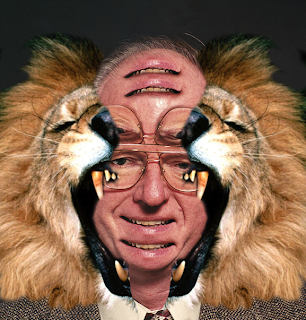
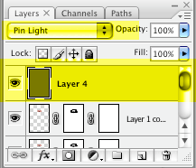
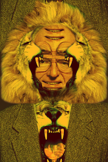
I continued to drag selections over from the lion image and work with layer masks in this way until the desired effect was achieved. The finishing touch was to create a new layer (CMND + SHFT + N) above all of the other layers in my layers palette and fill it with a warm color. Then I changed the blending mode for that layer to Pin Light.
Below is the final version:
For the following quick tutorial we will combine the image of a man and the image of a lion to create a hybrid construction that utilizes the most interesting elements of each image. See below.

First I made selections around the man's features, copied and pasted them onto a new layer.

Then I created a layer mask by targeting the layer I wanted to apply the mask to and click the "add layer mask" icon in the bottom of the layers palette. Once you click this button you will notice a layer mask has been added to your layer.

Using the brush tool you can paint into this layer mask with white or black paint to reveal or hide pixels respectively. Make sure you are on the layer mask and not on the layer itself when you are using the white and black paint. The double border around any layers thumbnail will ensure you are indeed on this layer. I used a soft brush and painted with black paint to hide the hard outer edge of the pasted layer.

I continued this process with the man's features until I came to an interesting combination. Remember that altering your brush size (bracket keys on the keyboard) and brush hardness will help manipulate the image.

Next I made a selection around half of my lion's face and dragged it into Photoshop. I duplicated the layer (CMND +J) and flipped it horizontally (EDIT > TRANSFORM > FLIP HORIZONTAL). I proceeded to use layer masks on these new layers to create a sort of mask around the head of the man.

I continued to drag selections over from the lion image and work with layer masks in this way until the desired effect was achieved. The finishing touch was to create a new layer (CMND + SHFT + N) above all of the other layers in my layers palette and fill it with a warm color. Then I changed the blending mode for that layer to Pin Light.

Below is the final version:

Monday, January 26, 2009
Layers Introduction
This process below for stitching together images does not use layer masks. Please see the above post for a more sophisticated procedure.
My advice to you for combining multiple images to create one large panoramic:
1) Give yourself a large enough CANVAS SIZE to work with (IMAGE > CANVAS SIZE)
2) Line the images up over one another accurately by reducing the opacity of the upper most layer (opacity slider in the layers palette)
3) Work back and forth with hard and soft edges with your eraser (CTRL click the document window while on the eraser)
3) Finally it is often helpful to toggle the upper layers on and off quickly to check for flaws (Turn on and off the eye icon in the layers palette)
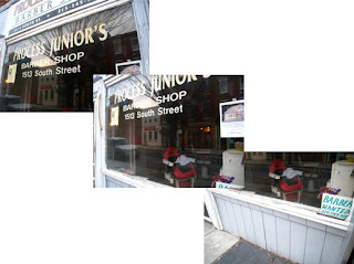
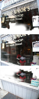
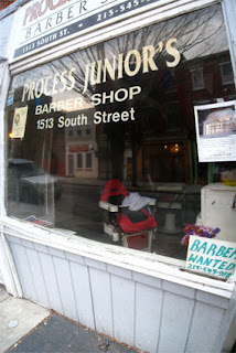
Above: Quiz 1 process. Left = original pictures. Middle = Erasure process. Right = Final
My advice to you for combining multiple images to create one large panoramic:
1) Give yourself a large enough CANVAS SIZE to work with (IMAGE > CANVAS SIZE)
2) Line the images up over one another accurately by reducing the opacity of the upper most layer (opacity slider in the layers palette)
3) Work back and forth with hard and soft edges with your eraser (CTRL click the document window while on the eraser)
3) Finally it is often helpful to toggle the upper layers on and off quickly to check for flaws (Turn on and off the eye icon in the layers palette)


Above: Quiz 1 process. Left = original pictures. Middle = Erasure process. Right = Final
Subscribe to:
Posts (Atom)